
[divider_flat]
Having trouble seeing the forest for the trees? The forest plot is a mainstay figure in systematic reviews which demonstrates the results from any meta-analyses that have been undertaken. Getting comfortable with forest plots will allow for easy and efficient interpretation of these results, and could save you from spending a lot of time pouring over the text and tables.
What does a forest plot represent? Let’s back it up a step and discuss what sort of results can be obtained from a meta-analysis. In a standard meta-analysis, results for two treatments (e.g. drug A vesus placebo) from multiple studies have been compared for a single outcome in each analysis (e.g. a dichotomous outcome such as total mortality). This comparison is represented in the form of a ratio describing the chances or ‘risk’ of the outcome occurring in patients treated with one treatment (drug A) versus the other (placebo).
[divider_flat]
[twocol_one] [/twocol_one][twocol_one_last]Treatment versus placebo – does one of these lead to a greater risk of mortality when compared against the other?[/twocol_one_last]
[divider_flat]
Statistical significance
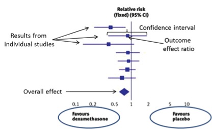
The ratio alone tells part of the story, but the 95% confidence interval surrounding this ratio is also needed to determine whether the difference between the two treatments is statistically significant (with 95% confidence). In studies that examine a dichotomous outcome (such as total mortality), a ratio of 1.0 would indicate no difference between the treatments. In these comparisons, a 95% confidence interval crossing 1 therefore indicates that the two treatments are not statistically different at the 95% confidence level, regardless of the value of the ratio. In studies that examine a continuous outcome (such as change in blood pressure), a mean difference is calculated rather than a risk ratio, and in this case a value of 0 would indicate no difference between treatments. Consequently, a 95% confidence interval crossing 0 indicates a lack of statistical significance in these cases. This key crossing point is typically represented on the forest plot using a vertical line, often referred to as the ‘no effect’ line.
Interpreting the box and line plot
Forest plots show the ratio and confidence interval from each individual study using a box and horizontal line plot. The location of the box on the x-axis represents the ratio value for that outcome in that particular study, and the 95% confidence interval extends out as lines from the sides of this box. The x-axis of this plot is important, as it indicates which side of the ‘no effect’ line favors the treatment versus the placebo. Note as well that the x-axis scale is often logarithmic rather than linear for dichotomous variables to allow for symmetrical confidence intervals.
When studies are compared in a meta-analysis, each study is not given equal weighting in the comparison. There are several reasons for this, the most obvious being that studies can vary widely in size. Meta-analyses also adjust the weight based on the uncertainty of the estimate; studies with wider confidence intervals will therefore be given a lower weighting than those with narrow CIs. Some analyses, such as those conducted by the Cochrane Review, adjust the weighting further based on the risk of bias assessment. Visually, the weighting of each study in the meta-analysis is indicated by the size of the square, with a larger square showing a higher weighting and vice versa.
Overall comparison
Finally, the overall comparison that takes the results of each study into account is shown beneath the individual study results in the shape of a diamond. There are no horizontal lines that extend out from this diamond; instead, the points of the diamond represent the limits of the confidence interval. If the diamond does not touch or cross the center line, the results of the meta-analysis indicate a statistically significant difference.
[divider_flat]
[divider_flat]
Although only a single individual study did not cross the ‘no effect’ line, the meta-analysis shows a significant benefit of dexamethasone over placebo for this outcome. Adapted from Gopalakrishnan et al. 2013.
A deeper dive
In addition to the visual content, forest plots typically show the numerical data supporting the figure. This can include the number of events that occurred in each group from each study (n/N), the actual percentage weighting value assigned to each study, the numerical value of the ratio and its confidence interval, and statistical test results for overall effect and heterogeneity. Often, you may want to take a closer look into these numbers as they can explain additional details that are not immediately apparent in the figure. The main results of the analysis, however, can always be ascertained from a quick glance at the forest plot.
References
Gopalakrishnan S, Ganeshkumar P. Systematic reviews and meta-analysis: Understanding the best evidence in primary healthcare. J Fam Med Primary Care 2013;2:9–14.